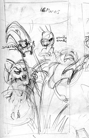
1. Rough layout. This is actually the second layout sketch I do, but the first one is just thumbnail blobs to decide how the panels will flow. This stage is on a sheet of 8.5 x 11" scratch paper, and it gets erased a lot.
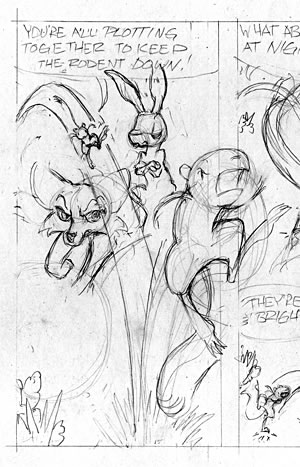
2. Pencils. I rule out the panel borders at 133% scale, and then do the "final" outline drawing. 133% is the biggest I could enlarge it on the paper I'm using. I'm working on an 8.5 x 11" card stock, so I split the page onto two sheets. This isn't totally ideal. I'd have more leeway with the page layout if I did it all on one big sheet, but I have a lot of this paper and it has a really nice surface that takes the ink well, so I'm going to use it up. This stage can take a while. Sometimes I have to sketch and re-sketch a panel, filling up a sketchbook page or two before I get the poses and acting to "good enough".
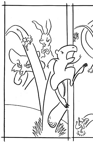
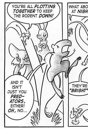
3. Inking. I rule the panel borders with a liner brush, and ink the line work with a hunt crowquill pen, and then I erase all the pencil lines. I strive for a graceful line that flows from thick to thin, and I cursed the luck that I'd picked this panel as my demo, because I saved it for last and pushed through to finish even though I was tired. About half the time I'm really happy at this point, and the rest of the time I'm a bit disappointed. Luckily, the shading takes some of the spotlight off the inking when it's weaker.
4. Pencil Shading. I needed shading to give at least a hint of that"night-time" feeling, but I didn't want the whole strip to be completely smooth photoshop shading, so I decided I'd put in some pencil texture first. This also allows me more speed and control with light and dark in the figures.
5. Lettering. I scan the inked and pencil-shaded pages and put them together into one file. I import that file into Adobe Illustrator and set the type. I use Blambot's Digital Strip font for most things, and a bit of his Mighty Zeo when I need lower case. Many, many thanks to Blambot for offering his fonts to independent cartoonists for free! Then I make the balloons with the circle and path tools.
I'll begin hand-lettering one day, but I'll start on some side projects first. I need more practice and I didn't want my slipshod lettering to drag Jack down with it.
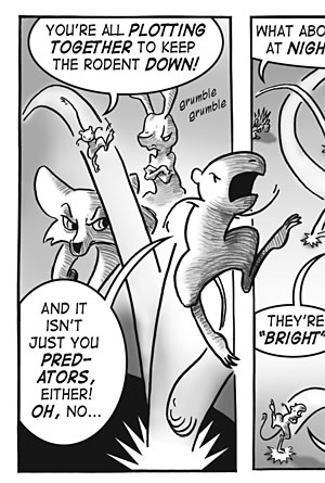
6. Photoshop Shading. I do this last in case I misjudged the space needed for type, to allow me to shift figures around first without too much trouble. I put the linework on its own layer, set it to "Multiply" mode, and shade on a few layers below that (one for figures, one of background tone, and one for foreground shadows, generally). I use a mouse for this (as opposed to a tablet), so I keep it pretty minimal.
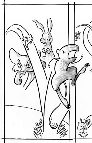
I also fix the line work in this stage (note the cleaner "starburst" at the base; I was trying something else here with the inks that didn't work because I was tired, so I cleaned it up at this point).
There's a lot more that can be done with texture and brushwork in coloring/shading with Adobe Photoshop, but to really take advantage of it, a tablet is pretty much a necessity. Perhaps I'll complicate my life with that extra bit of gear one day, but I'm not in a hurry...