OK! Here's part two of my little "How-To" feature. Click here to go back to the first page.
Inking
Pen vs. Brush: The babble begins...
When I started doing Jack, I used the pen exclusively. After a few episodes, I realized that I wanted more extreme variation in the widths of the lines, so I started using a brush for some of the heaviest contours. Over time, I grew to prefer the responsiveness and its ability (with practice!) to make both finer and fatter lines than I can make with the pen.
When I drew this episode, I started with the brush and did about 80% of the inking, and then switched to the pen, mostly to outline Jack's eyes and to do some of the finer lines on Mel with greater control than I could do them with the brush.
I currently do 99 to 100% of the inking on Jack with a brush, and only pick up the pen for a quick correction here and there.
Pros and Cons?
The pen feels more natural in the hand, at least at first, since we write with pens all the time. This is no ball point, though. You have to be conscious of how you're moving the tip across the page or it can jump, scratch, and spray. Holding it at a consistent slight angle (with the top, or round side, up), makes all the difference.
Because it's firm like a pencil or, well, a pen, the pen can lend itself to more confident lines and a greater feeling of control. It also lays a thicker bead of ink than the brush. The lines are raised a tiny bit on the paper. This makes it dry more slowly than a brush line, but it also makes it more resistant to damage from the eraser later on.
A brush is a whole other thing. It is totally alien if you're not used to it. Because it is made of hair and not firm metal, it feels like writing with air. A really good brush holds a fine point that allows you to make lines as thin or thinner than a sharp pen nib, and with no effort can make a single line modulate from a tiny hairline into a quarter-inch slab of ink. That flexibility makes for an incredible range of marks, but it also makes it easy to get the line weight wrong. You can be going for a light, whispering line, and one hiccup later, you're dropping a lead weight on the page. To sum up: the brush is amazingly sensitive and flexible, but WAY TOO sensitive until you get the hang of it.
Brush lines, unlike pen lines, lay flat on the page and dry almost instantly, but they also are more susceptible to erasure when cleaning up the pencil.
Line Weight Variation
This is the single thing that adds the most life to a cartoon drawing. It adds energy and movement to the most routine drawing. Honestly, you cannot have enough line weight variation. I was surprised at first -- I thought I was varying the lines a lot, but when I looked at the finished work, it still felt wimpy. So, especially on large or very active panels, I've learned to try to make those heavy lines REALLY heavy!
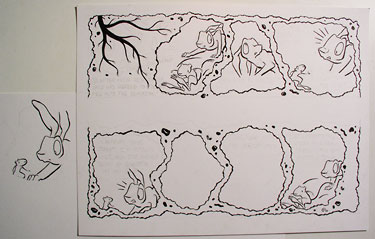
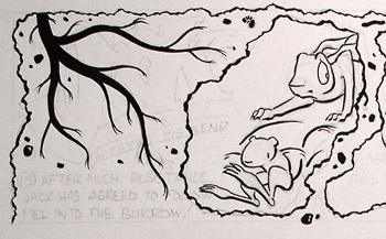
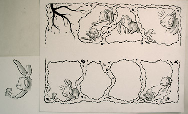
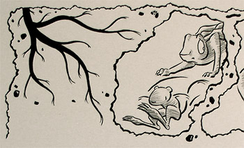
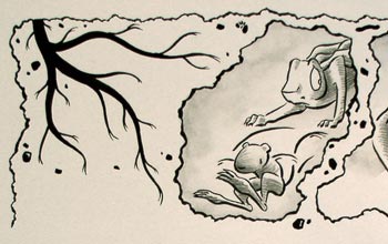
Generally speaking, it's a good idea to keep an idea of the direction of the light source. In Jack, the light source is most often the moon, EXCEPT when something really dramatic happens, in which case it can be very effective to pretend like the light is coming from the most dramatic thing in the scene (but only use this once in a while, or it loses its effect). In this episode, there is no light source because they're underground, so I just make one up.
With the light in mind, you can make the lines heavier on the shadow side of each object, and heaviest where the shadows would be deepest. When in doubt, make the lines heavier on the bottom towards the right and lighter at top left.
Pencil
After inking, I erase the pencil lines as gently as possible, and then I jump right back in and put more pencils back!
I wanted Jack to have a nice texture to it, especially because it's not in color (to make it cheaper, or even possible, to print!). So I came up with this thought of shading the characters with hatching in pencil before scanning and painting in the tone in Photoshop. I really like how it looks.
I do this part with my workhorse HB pencil. Line weight can suggest the light direction, but of course here it's ALL about the light direction.
In situations where I'm doing an interaction between characters and jumping back and forth with the "camera", I sometimes keep the light source strictly accurate, for example: Mel is facing Jack. The moon is off to Mel's left, so when I show Mel, I light him from the left, and when I show Jack, I light him from the right.
But more often these days, I keep it consistently from the right or the left for both of them. It's inaccurate, strictly speaking, but it can make the page look more coherent when the light direction doesn't jump around too much.
Ink Wash
This is the biggest change in my procedure since the first "Step by Step" feature.
Instead of painting in all the tones in Photoshop, I do most of them on the paper in ink wash before scanning. There were a few factors to this decision. I work on the computer all day doing graphic design, and spending many more hours on it adding tone to Jack was getting tedious. Also, I'm competent at this aspect of Photoshop, but I'm not a genius at it, I'm not particularly fast, and I don't have a tablet and stylus that enables pressure-sensitive brush line variation.
I am much better with a real brush in my hand, and it's more fun this way. A fringe benefit is the added texture of the paper and the ink particles. Some people have mastered Photoshop's textured brushes to the point that their work is at least as rich, but I'm just not there yet.
So I'm happiest doing things this way.
One thing that amazes me about traditional ink wash is that I can tone an entire episode with a single drop of ink. I start with 20-25 drops of water and one of ink, and I continue to add more water with the brush throughout the process. And even then I have to be very careful not to make it too dark.
I apply ink wash to the figures in keeping with the pencil shading, and then lightly brush shading into the backgrounds. I'll punch up the darks later in Photoshop.
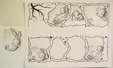
Scan and Piece
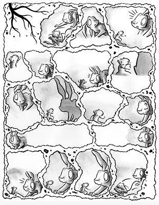
Once the ink wash is complete, I take the two pages of finished drawings to our office (where we keep the scanner), and I scan them at 600 dpi (or ppi, if that makes you happier) at the final print size. It is more or less standard to do original artwork at 150% of the final size (or whatever works with the paper you have available). This smooths out little irregularities in the inking.
If Jack was strictly line art (no grays at all), I would scan higher, at least at 1200 dpi, and possibly 1800 if the file size didn't get out of control. But grays are a different deal. They add exponentially to file size (and color adds exponentially on top of that), so 600 dpi is the highest practicable resolution, at least for this project on my system.
Then I stitch the two pages together into a single file, do some rough tone correction (make the whites really white) with Photoshop's Levels or Curves commands, and save a copy of the whole thing at 100 dpi to use as a guide for adding the type.
Type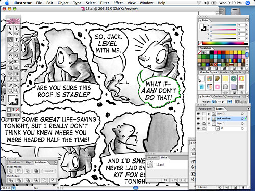
I add the type in Adobe Illustrator (Photoshop's drawing counterpart in the Creative Suite), and so the finished comic is an Illustrator file (which I later convert back into Photoshop and save as a low resolution jpeg for the web site, and a high resolution jpeg for the newspaper).
I use a 100 dpi version of the artwork when I'm actually setting the type because it lets me save the file faster while I'm working. And I add the type before I do the final clean-up and toning in Photoshop just in case I made a mistake and don't have enough room for some dialog. This almost never happens, but if I have to edit a drawing in Photoshop to make room for dialog, it's easier to do it before I spend a bunch of time doing that finish work.
Once I get the type all done, I'll polish up the artwork in Photoshop, and then replace my 100 dpi rougher version with the final, full-sized artwork.
I use a font from Blambot called Digital Strip, which I think has a really nice feel. I condense it to 90% width, so I can fit a little bit more letters in a given space without too much distortion of the letterforms.
I make the balloons with the ellipse tool, cut them at the edges of the panels, and then finish them, following the panel edges, with the pen tool. I draw the little "voice arrow" separately with the pen tool, and then combine the two shapes using the Union command in the Pathfinder palette. (In this episode, I see I forgot to put a little "arrow" on the balloon in panel 5). I fill them with white and give them a 1.5 point black outline.
Finish Work
Now I go back into Photoshop and do the real clean-up. I erase any smudges in the margins, and clean up the corners of the panels (in episodes with regular panels), and I try to make the whites white and blacks black without damaging the delicate grays of the ink wash.
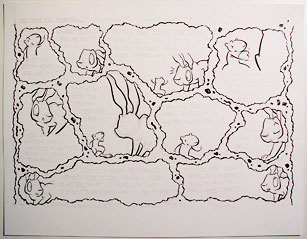
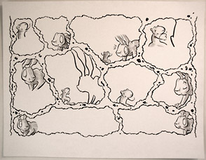
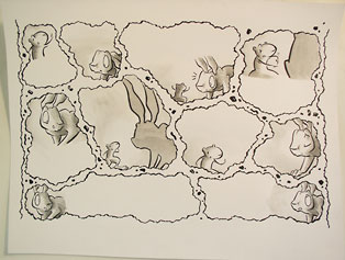
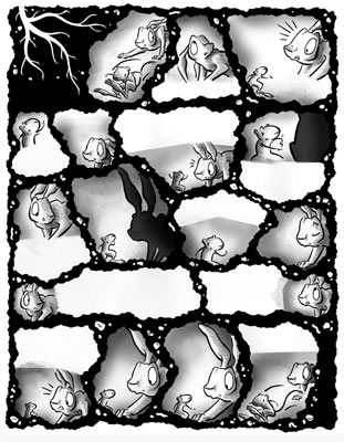
I fill in areas of black that I left open when inking. Sometimes it's a lot quicker to do a big area of black with the computer. In these underground episodes, I filled in the panel edges with black, while reversing out the roots, rocks, and worms, which took a bit of effort.
Lastly, I make a new layer and place it behind the scanned artwork. Then I set the mode of the scan layer to "Multiply," so that any tones that I apply behind it will appear, added to those of the scan layer.
I select each area that needs work with a combination of the Polygonal Lasso tool and the Quick mask tool, and then punch up the darks using the Brush tool with a 15% gray (also set in a Multiply mode, so my strokes are cumulative). I also add gradients to some of the backgrounds with a giant, soft Brush in order to give a feeling of ambient light.
End
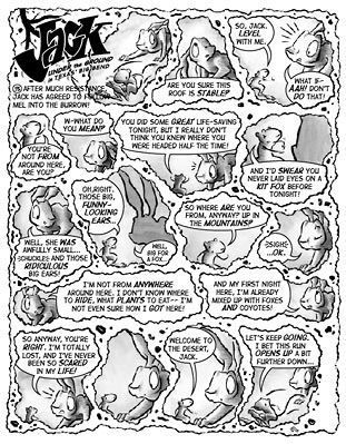
Back in Illustrator, I replace the low-resolution version of the artwork with the finished, cleaned and toned file. It drops into place at the same size, so the type needs no adjustment. And I'm done, except for opening the Illustrator file in Photoshop at different resolutions as needed for the web site and the newspaper's requirements. Here's the finished Episode.
If you've made it this far, thanks for your patience!
At this point, you know far more than you ever wanted about "The Making of...."
But if, against all reason, you want to know more, here is the first version of my process article, which MUCH more briefly covers a slightly different approach when I started out on the strip.